Do you thrive as a marketing expert, or are you motivated by the prospect of launching and growing a successful business? In either capacity you will want to master landing page conversions. Getting more conversions and clicks on your landing page is a difficult task. However, with a few tips, you can increase your numbers exponentially.
To make this happen, you must first create landing pages that convert. These pages will be designed specifically for conversions, with highly personalized content. Follow along in this article with 11 examples of the best Converting Landing Page.
What is a Landing Page?
Before we get to the main subject and learn how to create conversion pages to drive more clicks and conversions. A landing page is nothing more than a page designed to increase conversion rates, beat marketing goals, and grow your business. There is a variety in this field, and it can be a landing page on your home page or another page within your taxonomy. You can create a landing page specific to a campaign, product, or sale.
In your marketing campaigns, generating Leads must be an established priority in your campaign. There are many ways to do this: with content marketing, paid ads, social media, and various other means. Each campaign that your team creates must focus on one segment. Otherwise, the conversion of prospects will be lower than expected. In this sense, you will need a quality landing page to convert these visitors.
First, we will present examples of landing pages. After these examples, seven models of tips for building your conversion landing page will be listed.
1. Email Newsletter Subscription
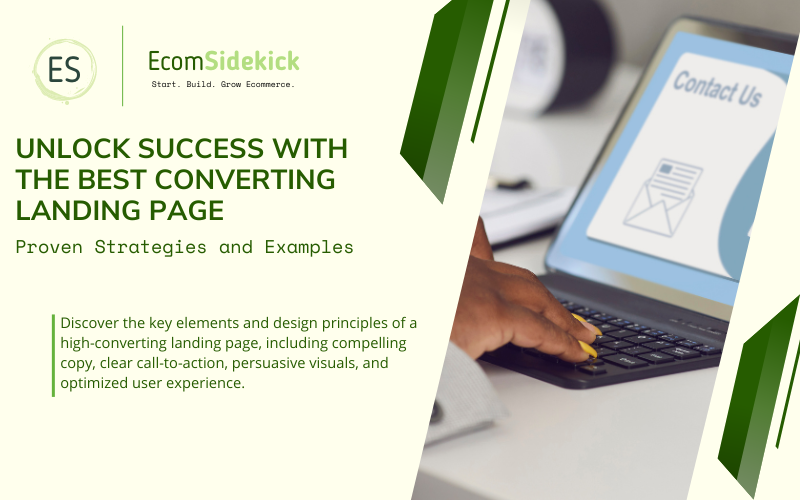
Imagine you write a blog about only one subject, such as economics, for example. You could offer your readers a newsletter that will be sent to them by email. They can subscribe to get recently published content on the topic of interest. Using CTA buttons to catch visitors’ attention is essential, so they will readily subscribe to your blog. You can leave the CTA linked to a separate landing page where they can sign up for the e-mail list.
2. E-books and Whitepapers
Materials to teach your prospects new things are popular. This way, you can create an elaborate topic in a whitepaper or e-book. To get more Leads, you can “lock” this content, which will be released only after completing a form.
3. Offer Event Registration
Online events work very well to collect information about your potential customers. You can offer your visitors several occasions, such as lectures, orientations, and others. Consider holding this type of event. You can generate many conversions with this strategy.
4. Online Courses
If you offer skills-based certifications or are in the education industry, consider that your courses need landing pages for conversion. With these landing pages, you can invite new students to sign up on your platform. This kind of content will add value to your potential customer, and there are private communication channels such as email and forums to discuss the content. Feedback on your student’s progress is vital to add trust to your landing page.
5. Offer Free Evaluations
If you offer a free demonstration of your products and services, you can do this through your landing page. For potential customers to take advantage of this free trial, have them leave their email address, job title, name, and information that you think is valuable.
6. Download Applications
Besides websites with full computer support, developing mobile device applications have become indispensable for your company to capture Leads. It is widespread that a good landing page for Leads invites your visitors to download an app. You can use Google Analytics to get more information about the people visiting your landing page and downloading the app. And, post that, use this collected data to make your landing page more efficient.
7. Value the Community
If your company is thriving on building a community among customers, creating a site dedicated to dialogue between users can be vital. And you can do this with a landing page, where your customers can sign up to become part of something more significant from your business.
Above, we have cited seven examples of conversion landing pages that you can create, garnering more Leads. In this sense, we will also mention some benefits that a landing page can bring.
Get Additional Information About Your Audience

You can track which topics have converted the most by creating several landing pages with segmented offers. This information is crucial.
You can see which content your audience likes the most and which channels Leads prefer. This data collected on your landing page is essential to drive a personalized and targeted marketing strategy. Your marketing team will take care of the best strategy by promoting the content and interacting with the audience through the channels they are using.
Consider that you have noticed that your e-commerce-related landing pages work very well. And that most potential customers find your landing page in their paid advertisements on LinkedIn and Facebook, for example. With this valuable information, you can target future campaigns, particularly your target audience. And there will also be a basis for incorporating some additional e-commerce content into your marketing strategy.
Increase Conversions:
This is the central topic of this article. Conversion-targeted landing pages are crucial to growing your Leads. You can link directly to an offer or next purchase step, bringing forward the value of your services and products. And you will also be able to encourage new visitors to provide you with valuable information in exchange for immediate rewards, such as a discount.
For example, imagine you visit a company’s website and automatically receive a pop-up form asking for information such as email, name, and phone number. You should ignore this pop-up and close the site, as it is too aggressive an approach.
Another possibility is a book you are interested in, and you find a free e-book from a company on social media. This company describes solutions to your problem. In this example, please consider providing your email address. Name and other data due to the right approach.
Many companies send traffic from advertising, social media, or email to your home page. And this strategy could be better. You need to know how to direct traffic to get to your site, increasing the likelihood of converting that traffic into Leads by using a targeted landing page for those conversions.
Imagine that users who convert landing pages of your e-book on social media are interested in social media, for example. And to further nurture these Leads, you send personalized emails specifying the additional content you will provide related to social media.
Increase your Email Subscriber List:
You can offer content on your landing page, and visitors will usually give you their name and email address. With this simple act, you can quickly grow your email subscriber list and even segment that list to provide personalized follow-up emails.
In short, your visitor will fill out a form in exchange for information or content about your service or product, showing interest in what you are offering on your landing page. This way, you will ensure that your subscriber list is filled with potential Leads.
Consider encouraging your subscribers. You can send a “thank you” email after they download your landing page offer.
Test your Landing Pages:
You can be very creative with your landing pages. You can test visual features, designs, resources, and text, observing which parts work best with your potential customers. In addition to these advantages, the risk of testing a new landing page is low. You will do this testing on new pages, avoiding design changes to the entire blog or established site infrastructure.
To quote AJ Beltis, acquisition and content manager at HubSpot directly: “If you’re using a content management system with a built-in A/B testing tool (like HubSpot), you can easily set up and run a test to see which copy, design, imagery, and page elements yield a stronger conversion rate. This means you can quickly uncover new ways to drive more leads and contacts for your business.”
Give Context For Your Offers:
One of the best advantages of creating a landing page is to give context to your marketing offer. In this sense, your prospects can skip the landing page processes and go straight to conversion.
However, this process can skip adding more context to your offering. Vital information and images can only be shared with a landing page that provides the necessary content before they decide to convert.
Measuring Metrics Directly Linked to Business Goals:
If you have created a specific landing page to sell a new service or product, you can measure metrics directly linked to your business goals.
Suppose your marketing team aims to increase sales of your new email tool, for example. In that case, you can create a landing page campaign offering a free demo of your Software.
And you can even measure the conversion metrics of your landing page, determining the performance of your campaign. With the results, you will make adjustments to communicate the actual value of your new product. And you are also allowed to measure which sites generate the highest conversions for your landing page and add more features to your tool marketing, using social media applications, for example.
Increase the Value of Your Landmark by Helping to Make a Good Impression:
One of the last benefits we will mention in this article about the use of landing pages is the good impression your landing page can add to your brand. With an elegant and well-planned landing page, you can impress your new visitors, possibly converting them into Leads. Demonstrate the unique content that your company can offer the potential customer.
In summary, a landing page is a space where you can let visitors know what you are offering. This can generate positive effects, such as conversions. Even if a viewer waits to convert visitors, by designing a landing page well, the likelihood of increasing your brand awareness and helping convert Leads in the future is very high.
We use as an example the landing page created by Talisker, the “Ceros” website, which offers whiskey. An immersive experience is used on this Ceros landing page, where the brand value is demonstrated, making an impressive first impression for your new visitors.
Your landing page doesn’t have to be boring. In fact, it should never be. Put considerable time into creating your landing page, making it interactive, attractive, and engaging, and passing on the value of your brand to your potential customer.
We will present eleven landing page examples to help you build your landing page. You will get inspired, and your creativity will flow without needing copy, images, and design.
Before you start though, it would be helpful to drill down into these resources to understand better how landing page platforms work:
- ClickFunnels vs Leadpages
- Leadpages vs Unbounce
- ClickFunnels vs Kajabi
- ClickFunnels vs GrooveFunnels
- ClickFunnels vs Instapage
- ClickFunnels vs Builderall
The Best Converting Landing Pages

Source: Ecommerce CEO
1. Tushy: Bold Landing Page
We use as an example the website “Tushy“, a very humongous landing page with a decoupage design, pastel colors, a navigation bar, eye-catching buttons, a full-page pop-up, and a chatbot.
Tushy’s proposition is clear, it’s time to stop wiping your ass and start washing it with an affordable bidet. But what is their target audience? Everyone who poops. That is all people of all ages. There is a bright and flashy pop-up and a chatbot when you open the page.
There is a CTA button. Sign my A**. And in case you refuse, below is “No thanks, I don’t want a clean butt.” which denotes a clever landing page technique.
2. Simply Chocolate: An Example of a Landing Page
The Simply Chocolate website has a remarkable landing page design. Possessing an attractive, large, and unique navigation bar. Its navigation bar is simply extraordinary, with vertical options, ignoring the endless similar menus on the internet. And when you hover your mouse over the navigation bar, Simply Chocolate presents the story of its company, playing out in the background, with its story about sustainability, lightness, and joy.
The Simply Chocolate menu bar matches the color scheme and hides the treat, demonstrating an extraordinary technique.
The visitors’ choices of options are limited. The only options are to click on the unwrap arrow and see the fully unwrapped chocolate bar. It is also possible to scroll down the page and see other chocolate bar options or click on the “YOUR BOX” link to see your cart.
Your main product is present in the menu bar. However, it is in a hidden way, and it is an exciting teaser. For the visitor to see the chocolate bar, he will have to scroll down the page. And then, the menu will slide from top to bottom. This design is extraordinary.
When the visitor clicks the down arrow on the package, he will pull the package until the box is fully exposed, and this action will add the product to the shopping cart. This click animation is very clever, encouraging the potential customer to interact with the website.
When scrolling down the page, you can see the other chocolate bars, and you can choose your favorite. All of them have the same effect as above, of unwrapping the product and, in the end, adding it to the shopping cart.
A lot of time and effort went into building this landing page for conversion. It is possible to see all the products directly linked to this landing page, where there are several innovations, both as to its visual, with vibrant and vivid colors, elaborated animations, and page fluidity.
3. VanMoof’s Minimalism
We observe in the second example a complex landing page. Full of details, animations, vibrant colors, and vivid details. However, you can achieve success with your landing page by being minimalistic. The website “VanMoof” offers state-of-the-art market e-bikes. As soon as you enter the portal, their futuristic bicycles are presented. The page loading is high-speed, and there is a beautiful looping animation. And that is basically what this minimalist landing page is all about.
The picture used in the looped video when the visitor accesses the page has beautiful photography with an ultra-minimalist color scheme. What is very striking when entering this page is the limited choices. In short, you can book a tour, discover or scroll.
VanMoof’s navigation bar is straightforward. The potential customer is offered to learn about their e-bikes, check the two colors available (light for short people and dark for tall people), buy accessories, and schedule a test ride.
4. Eiger Extreme, an Incredible Design
Mammut’s “Eiger Extreme” features an extraordinary landing page. When you go to the website, it is impossible not to notice that this company sells products related to excellent equipment, and this is genius.
When scrolling down the page, many things happen. However, even then, not much information is given to the potential customer. In fact, this landing page is simple and exciting. This is because many different effects happen as the visitor scrolls. There is a combination of vibrant colors and a journalistic copy treatment.
The page gets darker as the text appears. The high-contrast colors are set against these soft backgrounds and grab the visitor’s attention.
Eiger Extrem’s navigation bar is a guide located at the top of the screen, clickable from anywhere. And to highlight the four critical elements of Mammut’s value proposition, it is necessary to scroll down the page, where there is a video documentary, encouraging even the most layman to take an interest in the climbing experience.
Without a doubt, this is a destination page that tells a fascinating and adventurous story. The dedication to building this site is evident from start to finish. Indeed, this landing page successfully achieved many conversions and has a wide variety of products in its catalog.
5. Lucciano, Use of Videos
As the title suggests, “Lucciano“, a landing page focused on presenting its stores and products, has many looped videos and animations on its website. The visitor is shown the manufacturing process of various popsicles and gelatos when accessing the homepage.
There is a scrolling slider where all the products are displayed. This allows you to hover the mouse. When you hover the mouse over a product, a simple color-coded highlight appears, instantly offering more information about the product.
The menu opens a navigation bar where more videos are played. Scrolling through the menu options, a big extravaganza is presented to the potential customer. The background of this landing page conveys a colorful photograph of the product, with plenty of white space to highlight its products. This landing page will make you rethink how to present your food products.
6. Karst Stone Paper, Simplicity and Sustainability

“Karst Stone Paper“, a company that offers simplicity in its products, does the same on its landing page. A landing page like this proves there is no need for complexity, like exaggerated information and too many pop-ups, keeping the visitor from converting.
With short animations, simplified line art, neutral colors, and a powerful message about sustainability. It maintains its products’ value proposition: papers not made from trees. Karst Stone Paper’s compositions are made from resin and gravel.
A black tab appears for the visitor as soon as the video animation ends. The following message is displayed: “Take note of what matters most.” This reinforces the idea of their products’ value: protecting and saving the environment.
With several product options, Karst Stone Paper teaches you a lot about their product, making it possible to customize the product and even read their blog, Bookmark. For example, suppose you add one of the notebooks to your cart. In that case, you will be informed that you are buying something waterproof and a more durable product than paper. Besides the fact that it is shinier and smoother than paper. You will also be told whether you get free shipping if you buy another product.
One of the most eye-catching features of this landing page is the information. Most people do not know that making paper from 100% recycled stone is possible sustainably, saving trees, bleach, water, acids, and chemicals. Besides a successful landing page, Karst Stone Paper conveys much learning to its potential customers.
7. Gumroad: An Eccentric Landing Page
Featuring a high-contrast globe with mirrored balls on its homepage, the website “Gumroad” features a somewhat eccentric design. After all, what are the designs featured? Bubble gum? Planets? Is this a Gumroad? This draws a lot of attention from its visitors.
The value proposition on Gumroad is laser-focused, making it clear that servants are their target audience, highlighting the benefits, such as ease of payment. Scrolling down the page, you find the social proof, like the year they started and how much money the creators have made. And there is more recent data, like last week’s data, showing the number of registered creators, amount of countries, and the total money transacted.
And there is also an additional value proposition: “The creator economy is just getting started. Say this aloud: I deserve to make a living doing what I love.” and a CTA button to start selling.
It is explicit that Gumroad’s payments work for many online businesses. However, they have chosen to focus on small teams and individual creators. And they make this clear in the elements of the page copy.
8. The Effectiveness of Groove’s Landing Page
We will look at a landing page proving to be very effective in conversions. The company “Groove“, after securing a monthly revenue of $50,000, implemented a new design and increased its conversions by 100%.
Like their product, Groove designed their landing page to be simple and effective. Outside inserted a header alone, which sells their product alone. There are some questions and answers that this landing page shows your potential customers:
This Landing Page Presents Certain Questions and Answers to Potential Customers |
What: a customer service software |
How: with simple, complete, fast, and top-quality support |
Why: you will reduce costs and generate more sales |
Who: small businesses |
Where: With the free demo available here |
When: Start your free trial right now. No credit card is required. |
Communicating the benefits your prospects will gain is conveyed clearly on Groove’s landing page. The idea that your Software is easy to use and will make your customers happy is well established.
Scrolling down the page will allow you to see a screenshot of the entire width of the Software. This way, you will know precisely what the Software and its tools look like. In addition, several social proofs demonstrate the company’s reliability. There are fascinating reports like this: “With Groove’s help, we’ve seen a 20% decrease in support volume, a 46-minute faster response time, and our happiness score is up to 89%.” In this way, reliability and effectiveness become evident.
9. SquareSpace: Sobriety and Beauty
A tool for creating websites, “SquareSpace” used a lot of contrast and brightness in its landing page, standing out a lot in that regard. The company argues that you can turn any idea into reality. In that logic, they have the landing page to support you.
SquareSpace’s value proposition is well defined: create your website with a beautiful design.
There is a box on the left, and a slider shows three more impressive creations, demonstrating the variety they have on their platform.
On this landing page, the features that you can implement on your landing page are made evident to the visitor. They save words and show what you will actually be able to do.
With a clean look, the SquareSpace landing page is modern and has a “high-end” design. Demonstrating the beauty and sobriety that a company that offers design creation needs.
10. Unbounce: Landing Page Expert
The company “Unbounce” is one of the best examples we will present in this list. This statement is justified by the fact that they offer Software that creates landing pages. After all, we expect a page that builds landing pages to be presentable.
A benefit statement is an excellent choice for a title. The company offers three benefits in three sliders in three seconds, “Convert more leads, sales, and customers.” this strategy is overwhelming.
There is no coding required to get your landing page with Unbounce. There are several examples to the right of the page. According to the company, the higher the contrast, the higher the number of conversions.
Two features for simplifying conversions are Conversion Intelligence and an AI feature, Smart Traffic. And it is explained to the prospect exactly what each tool offers.
The social proof that Unbounce demonstrates to visitors is several testimonials, with real numbers, reporting the effectiveness of Unbounce in increasing conversions for their clients. This strategy proves efficient, and the company adopts this method of showing more than telling.
11 – Gravity Payments, Trusted Landing Page
There are several ways in which you can win over your potential customer. There are more than one or two efficient techniques that will make your company get more conversions with a landing page. “Gravity Payments” subtly communicates two things to your visitors:
1 – Speak directly to your target audience
2 – Create a meaningful sense of trust, enabling increased conversions.
Consider that you are a small business owner in the construction industry. You work with a high volume of low-margin transactions every day. You are totally overwhelmed by credit card companies. You think you need to be bigger and an entrepreneur to be heard.
The Gravity Payments company is targeting you, especially you. Although they have a wide variety of people who need processing services, they only talk to you. Notice a direct quote present on their landing page:
“We reduce the costs and headaches of accepting credit card payments by providing low-cost solutions, transparent pricing, and the best customer service.”
This exclusivity creates great trust for their potential customers precisely because they drive their goals directly to a specific group. Gravity Payments focuses on small business owners, with the exclusive nature of their words generating a lot of trusts.
Gravity Payments’ landing page has an animated step-by-step, with five steps showing their services’ value in a few clicks. In addition, there is a lot of practical social proof that makes the visitor think that this is the best way your company can receive payments.
Final Thoughts

From the above, a landing page brings many advantages to your company. You will get more subscribers in your email list and even get many conversions. And to do this, take a clear look at the eleven examples we have provided.
Each sample has peculiarities and differences, from straightforward and simplistic designs to landing pages with flashy colors and looped videos. It doesn’t really matter which one you choose.
All you need is an effective strategy with your team, clarity on a practical project, and inspiration from one of these projects. Start working on a landing page focused on more conversions today.
Frequently Asked Question
Are There Specific Industries or Niches That Tend to Have the Best Converting Landing Pages?
The effectiveness of a landing page depends on various factors, including the industry, target audience, and the offer being promoted. While some industries may have common practices for high-converting landing pages, there is no one-size-fits-all answer. A well-optimized landing page in any industry can yield excellent conversion rates when it is tailored to meet the specific needs and preferences of the target audience.
How Can I Test the Effectiveness of My Landing Page?
You can test the effectiveness of your landing page through A/B testing or split testing. Create different versions of your landing page, making only one or two changes at a time, such as the headline, CTA button color, or image. Run the tests simultaneously and measure the conversion rates for each variation. This will help you identify which elements are more successful in driving conversions.
How Can I Track the Conversion Rate of My Landing Page?
To track the conversion rate of your landing page, you can use tools like Google Analytics or other marketing automation platforms. Set up goal tracking for the specific action you want visitors to take on the landing page, such as form submissions or button clicks. The conversion rate is calculated by dividing the number of conversions by the total number of visitors and multiplying by 100 to get the percentage.

Paul Martinez is the founder of EcomSidekick.com. He is an expert in the areas of finance, real estate, eCommerce, traffic and conversion.
Join him on EcomSidekick.com to learn how to improve your financial life and excel in these areas. Before starting this media site, Paul built from scratch and managed two multi-million dollar companies. One in the real estate sector and one in the eCommerce sector.